Crafted
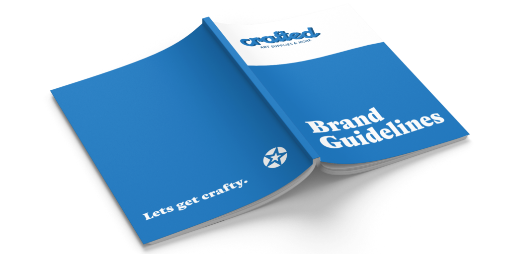
Crafted the framework for endless creativity. The Challenge Built on community, playfulness, and a love for all things creative, Crafted is a fictitious art store designed to inspire every kind of maker. Tasked with developing a full visual identity, this project called for a cohesive logo and a detailed brand guidelines book that felt welcoming, artistic, and true to Crafted’s personality. Client Crafted Know-How Adobe InDesign Adobe Illustrator The Outcome Crafted’s brand guidelines bring structure to a colorful, spirited identity. The book opens with an overview of the brand’s mission and tone, followed by a detailed color palette and type system that reflect Crafted’s playful yet reliable nature. A complete logo guide outlines proper usage, spacing, and applications to ensure consistency across future designs. Imagery guidelines help maintain a bright and approachable aesthetic, while brand application examples demonstrate how the identity comes to life across packaging, signage, and digital touchpoints. Together, these elements create a flexible and expressive system that supports everything Crafted stands for: community, creativity, and the joy of expression. Previous Case Study
EDGE Fashion Magazine
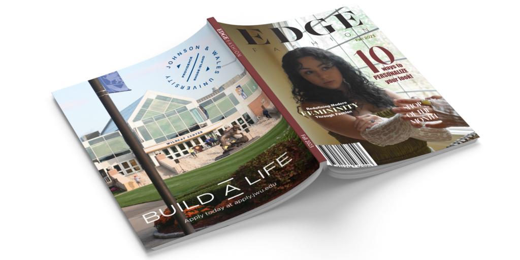
EDGE Fashion Magazine editorial that doesn’t play by the rules. The Challenge Known for breaking the rules, EDGE Fashion Magazine showcases fashion with a twist – an edgy twist. This magazine contains original imagery and content showcased using unique editorial layouts. Client EDGE Fashion Magazine Know-How Adobe InDesign Adobe Photoshop Adobe Illustrator The Outcome Modern fashion with an edgy twist, EDGE Fashion Magazine is best known for its funky style and breaking the rules. Packed with compelling imagery, unique typography, and impactful layouts, EDGE thrives on pushing boundaries. Designed from scratch, this magazine includes a compelling cover, interview and article spreads, a creative page, and two full-page print advertisements. To match EDGE’s branding, disregarding the rules of editorial design while laying out some of these pages was a must. From breaking the grid to using unique typefaces, this goal was achieved. Previous Case StudyNext Case Study
Southern Comfort
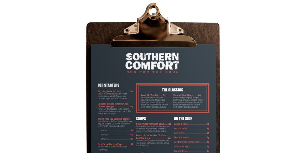
Southern Comfort taking southern barbecue and adding some heat. The Challenge Southern Comfort is a small restaurant located in Nashville, Tennessee. With a tagline like “BBQ for the soul,” Southern Comfort needed a menu design that spoke true to this message. With previously established content, this menu required a unique and compelling composition to draw in customers. Client Southern Comfort Know-How Adobe InDesign Adobe Illustrator The Outcome Serving comfort food with a side of style, Southern Comfort’s menu is now bold, eye-catching and easy to follow with this stunning editorial layout and typographic treatment. The menu features everything from starters to desserts, along with a callout section that showcases their “classic”, crowd-favorite dishes. Wrapped in a rich deep blue with captivating red accents, the design perfectly reflects Southern Comfort’s tagline, “BBQ for the soul.” Overall, this menu brings both flavor and personality to the dining experience. Previous Case StudyNext Case Study