FurnishPop
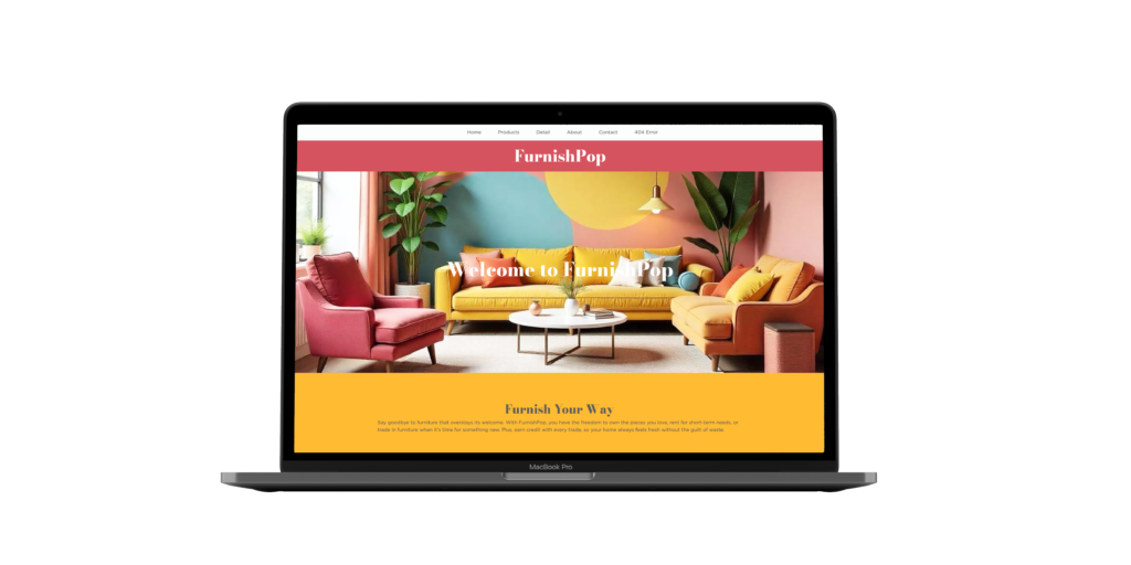
FurnishPop bright, bold, and built to last. The Challenge FurnishPop is ready to handle all your furnishing needs! Built around the idea that furniture should be fun, functional, and far from wasteful, this fictitious company gives users the option to buy, rent, or trade their pieces. The challenge was to create a six-page responsive website that showcased FurnishPop’s vibrant personality while emphasizing its mission to keep old furniture out of landfills. Client FurnishPop Know-How Bootstrap Figma The Outcome FurnishPop’s website brings playful energy to sustainable living. Designed in Figma and coded in Bootstrap, this six-page site showcases a cohesive and engaging experience. The homepage welcomes users with bright visuals and a bold introduction to the brand. The products page highlights an array of colorful, modular pieces, while the detail page gives shoppers a closer look at each item, complete with flexible purchasing options. The about page shares FurnishPop’s commitment to circular design, and the contact page keeps communication easy and inviting. With its eye-catching aesthetic and user-focused layout, FurnishPop proves that sustainable furniture can be both stylish and accessible. Previous Case Study
Rooted Indoors
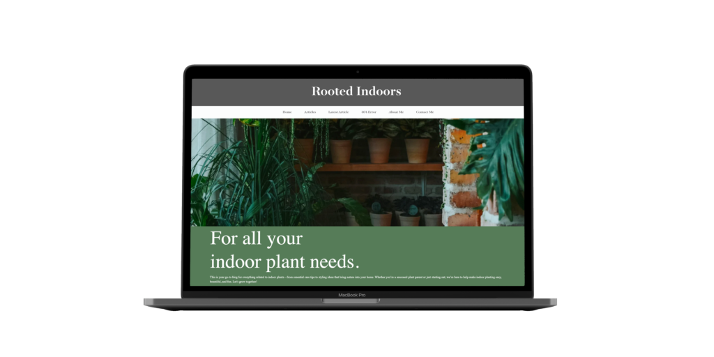
Rooted Indoors where tips, tools, and design take root. The Challenge Here to answer all your plant questions, Rooted Indoors is a fictitious online plant blog designed to help plant lovers of any experience level find simple tips and reliable guidance. For this fully responsive six-page website, the goal was to build a clean, welcoming space that feels both educational and approachable. Client Rooted Indoors Know-How Bootstrap Figma The Outcome Rooted Indoors offers a seamless and engaging browsing experience for every plant enthusiast. The homepage introduces users to the brand’s friendly tone, while the articles page organizes blogs for easy discovery. A dedicated latest article page highlights new posts, and an intentional 404 error page keeps the experience both functional and on-brand. Rounding out the site, the about me and contact pages give Rooted Indoors its personal touch by sharing the creator’s background and an easy way to get in touch. With its thoughtful layout and user-centered structure, Rooted Indoors provides a warm and informative experience for anyone looking to grow their indoor jungle. Previous Case StudyNext Case Study
Alpine Hiking Co.
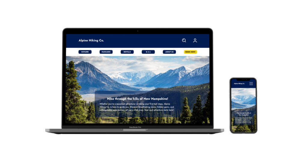
Alpine Hiking Co. trail-ready design for every explorer. The Challenge Here for all your hiking needs, Alpine Hiking Co. is a travel company that can help you book your next adventure through the hills of New Hampshire. When tasked to create four different web pages for this fictitious travel company, keeping the design user-focused would ensure the overall success of this website. Client Alpine Hiking Co. Know-How Figma The Outcome Ready to hit the trails? Alpine Hiking Co. has you covered with a fresh, user-friendly website built to guide adventurers through the New Hampshire hiking trails. The homepage features clear directories for everything hikers might be searching for, from available trips to equipment rentals to a quick overview of the company. The About page digs deeper, sharing how the company started, where they are now, and their mission. The Explore page highlights every trip offered, complete with a weekly spotlight to inspire new adventures. Lastly, the details page gives users a closer look at any trip they’re interested in. With this new design, Alpine Hiking Co.’s website not only draws in potential hikers but sets itself apart by focusing on an intuitive, user-centered experience. Previous Case StudyNext Case Study
Boston Children’s Museum
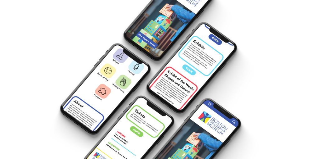
Boston Children’s Museum a modern, playful take on a childhood favorite. The Challenge When tasked to redesign the Boston Children’s Museum’s mobile website for an academic project, playing into the childish side of this design was the right way to go. The existing mobile design, while functional, had some usability issues that made this redesign a breeze. Client Personal Know-How Figma The Outcome Bold, bright, and user-friendly! This redesign of the Boston Children’s Museum website brings new life to the experience. Addressing key issues in the original site, the updated design uses vibrant color, clearer hierarchy, and simplified navigation to make information easier to find. Mapping out the typical user path helped shape a layout that feels more intuitive and less overwhelming. Overall, the Boston Children’s Museum’s refreshed site now offers visitors a smoother, more accessible, and far more enjoyable experience Previous Case StudyNext Case Study
The Greenery
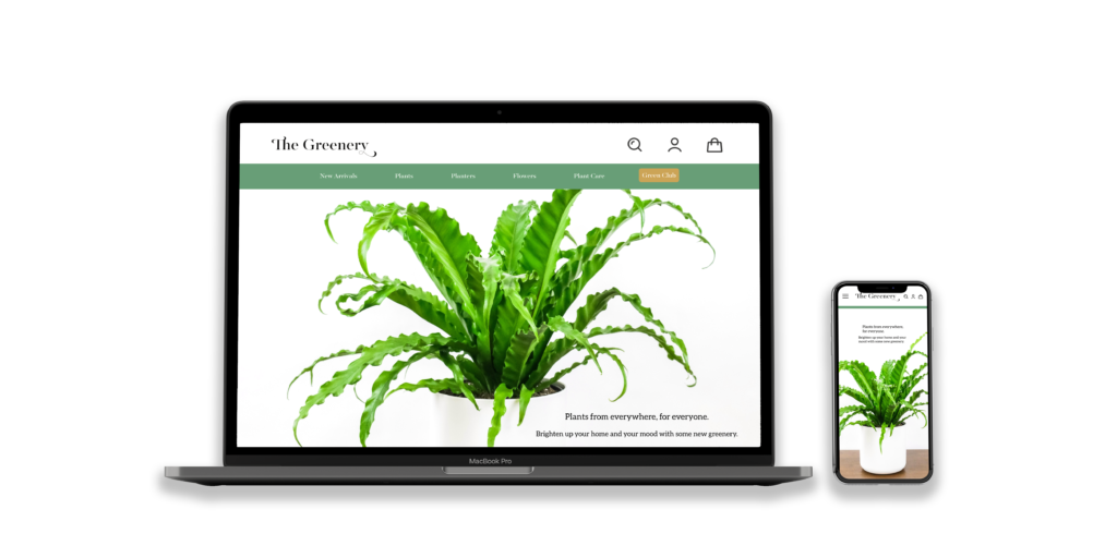
The Greenery rooted in good design, for plant lovers. The Challenge Stocked full of all the plants you could ever dream of, The Greenery is an online plant shop that needed a desktop and mobile website. When tasked with designing six web pages for this fictitious plant shop, a user-focused design was crucial. Client The Greenery Know-How Figma The Outcome Simple yet compelling, these web pages make it easy for shoppers to explore The Greenery’s full range of indoor and outdoor plants right at their fingertips. The homepage highlights a curated mix of products, current promotions, and a spot to sign up for the newsletter. The product page keeps things efficient with filtering options that help customers quickly narrow down their search. Finally, the detail page dives deeper into each item and includes an option to add products directly to the cart. Overall, The Greenery’s streamlined design and thoughtful layout create a seamless shopping experience from browse to checkout. Previous Case StudyNext Case Study
NightShade Italian Cuisine
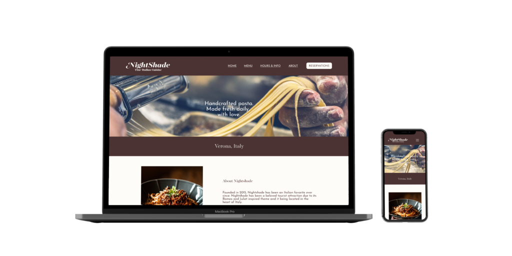
NightShade Italian Cuisine serving up style and usability, al dente. The Challenge Located in the heart of Italy, Nightshade Italian Cuisine is a favorite amongst locals and tourists. In need of a user-friendly website, complete creative freedom was granted while designing these three cohesive web pages for this fictitious restaurant. Client Nightshade Fine Italian Cuisine Know-How Figma The Outcome Classic elegance coupled with easy navigation helped create this user-friendly design featuring a unique color palette, timeless typefaces, and user-focused page sections. The homepage sets the tone with a strong hero section, a quick paragraph about the restaurant, upcoming events, and a short highlight about the chef. The menu page keeps things simple but charming, showcasing a wide range of food options set in a modern sans-serif. Built for efficiency, the reservation page makes booking a visit fast, straightforward, and stress-free. Overall, NightShade’s clean design and thoughtful layout aim to give users a great experience with every click. Next Case Study