Blue Birch Provisions
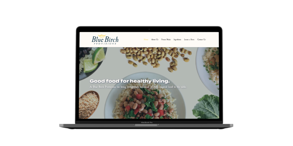
Blue Birch Provisions “good food for healthy living.” The Challenge Blue Birch Provisions came to us looking for a refreshed brand identity, cohesive packaging for their frozen meals, and a modern website. In this collaborative client project, the packaging process was led by my teammates, while I designed and developed a user-focused, store locator informational website. Client Blue Birch Provisions Know-How Adobe InDesign Adobe Illustrator Figma WordPress The Outcome Blue Birch’s new website focuses on creating an intuitive experience that highlights their nutritious ingredients and core brand values. The About Us page highlights Patricia & Robert’s journey as Blue Birch came to be, the Ingredients page explains how “each ingredient earns their place,” and the Store Locator page does just that. Across digital and print, Blue Birch Provisions hits the market with a cohesive identity, 100% plastic-free packaging, and a lively website. Previous Case Study
Pouch
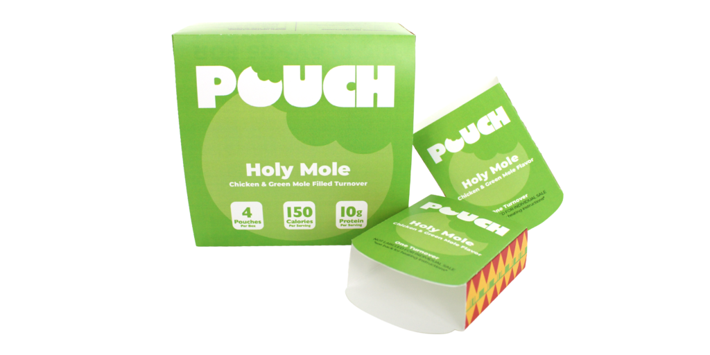
Pouch “big flavors for small appetites.” The Challenge In search of branding that fit their motto “Big Flavors for Small Appetites”, Pouch came to us looking for a bold & fun brand identity, as well as packaging for their frozen GLP-1 friendly-turnovers, and a cohesive social media presence. In this collaborative client project, our team worked with two entrepreneurship students to bring Pouch to life. Client Pouch Food Products Know-How Adobe InDesign Adobe Illustrator Canva The Outcome I led the overall branding and box design, exploring bold typefaces & vibrant colors that allowed this brand image to pop against other trendy, healthy meal alternatives. My partner led the turnover sleeve design. Similarly to the box, both packaging deliverables required close attention to detail, ensuring all required legal jargon was properly included. Previous Case StudyNext Case Study
Clean Living Infusions
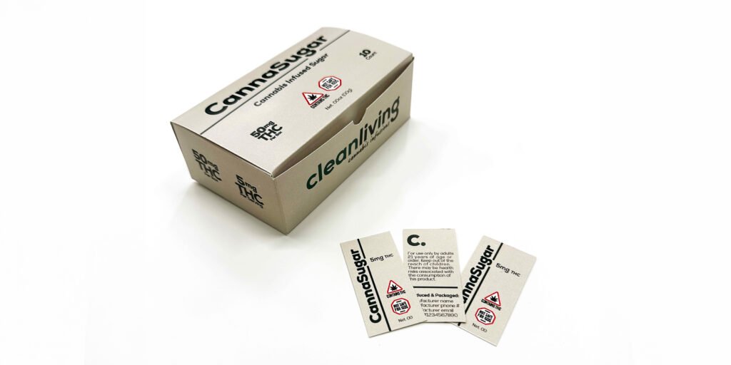
Clean Living Infusions a sweet take on medicinal design. The Challenge In this collaborative client project, our team was tasked with developing a full brand identity for Clean Living Infusions, a company producing CannaSugar for medicinal use. The project required a cohesive logo, branding system, packaging design, and social media templates to strengthen the company’s visual presence. Client Clean Living Infusions Know-How Adobe InDesign Adobe Illustrator Canva The Outcome While my partner led the logo and overall branding, I focused on creating clean, modern packaging for the CannaSugar product and designing a set of social media templates to help the brand maintain a consistent, professional digital presence. Together, these elements create a polished and trustworthy identity that helps Clean Living Infusions stand out in the medicinal market. Previous Case Study
Crafted
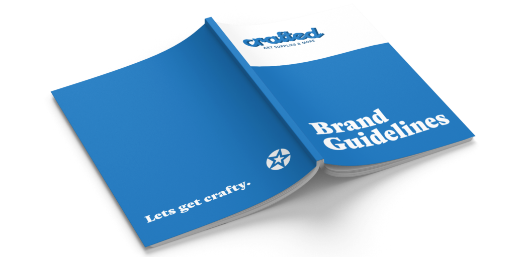
Crafted the framework for endless creativity. The Challenge Built on community, playfulness, and a love for all things creative, Crafted is a fictitious art store designed to inspire every kind of maker. Tasked with developing a full visual identity, this project called for a cohesive logo and a detailed brand guidelines book that felt welcoming, artistic, and true to Crafted’s personality. Client Crafted Know-How Adobe InDesign Adobe Illustrator The Outcome Crafted’s brand guidelines bring structure to a colorful, spirited identity. The book opens with an overview of the brand’s mission and tone, followed by a detailed color palette and type system that reflect Crafted’s playful yet reliable nature. A complete logo guide outlines proper usage, spacing, and applications to ensure consistency across future designs. Imagery guidelines help maintain a bright and approachable aesthetic, while brand application examples demonstrate how the identity comes to life across packaging, signage, and digital touchpoints. Together, these elements create a flexible and expressive system that supports everything Crafted stands for: community, creativity, and the joy of expression. Previous Case Study